
Table of Contents
Opening: A user-first case for holographic coating
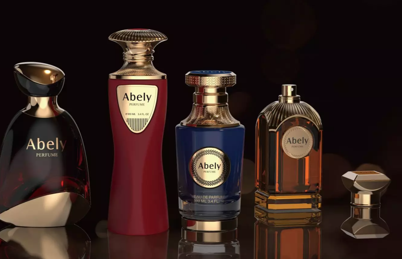
Think of your customer holding a bottle at a counter — their thumb finds the bevel, their eyes catch the shimmer, and a tiny dance of light suggests luxury before the scent ever speaks. For teams focused on perfume bottle design, applying a professional holographic coating isn’t just decoration; it’s a UX moment that converts curiosity into emotional purchase. As someone who cares about how physical form factors meet human perception, I want to center the user: why they pause, why they pick, and how a holographic finish answers that need.
Why holographic coating matters to users
Users respond first to touch and sight. Holographic coatings create depth, movement, and a perceived value that a flat finish rarely achieves. This is especially true when your audience associates packaging with storytelling—think of Chanel No.5’s minimalist bottle from 1921 and how its silhouette became shorthand for timelessness. A holographic layer can modernize that shorthand without erasing heritage, giving audiences a contemporary cue that the fragrance inside has a curated identity.
Design principles to guide decisions
Start with intent: decide what the shimmer should communicate—playful, futuristic, elegant—and let that intent shape materials, opacity, and pattern. Practical tips:
– Match holographic intensity to brand tone; subtle micro-holographic texture for niche luxury, bold rainbow shifts for youthful lines.

– Use gradients and selective application to guide the eye toward logo or nozzle—think of light as a directional UI element.
– Prototype in real light conditions; glossy phone photos lie. A mock on a retail shelf often reveals surprises.
Materials, processes, and common pitfalls
Holographic effects can be achieved via cold foil, hot stamping, vacuum metallization, or specialty lacquers. Each has cost, durability, and tactile implications. Common mistakes I see: over-application that obscures typography, choosing a process that flakes under frequent handling, or ignoring regulatory concerns for perfume-contact materials. When you start to create a perfume bottle, insist on samples with real-world handling tests—drop, rub, and sunlight exposure—before committing to mass runs.
Testing, metrics, and user research
Measure both qualitative and quantitative signals. Run short in-store A/B tests with two finishes, track lift in first-touch purchases, and collect micro-feedback via intercept interviews. UX-friendly metrics to follow:
– Shelf appeal score: quick ordinal rating from shoppers.
– Touch retention: percentage of users who pick up the bottle after initial glance.
– Durability index: wear observed after standardized abrasion cycles.
These numbers tell stories—sometimes the shimmer wins attention but fails durability. You want both, not one at the expense of the other.
Common project flow and where teams stumble
Typical timeline: concept → CAD mock → prototype coating → consumer test → production. Teams slip when they compress prototyping, assume lab-grade finishes will scale unchanged, or fail to include manufacturing early. Involve suppliers in the design phase; they often suggest subtle process shifts that keep aesthetics while cutting cost. And remember—brand heritage matters. If your fragrance nods to classic forms, keep holography tasteful, not shouting.
Summary: synthesis of user-centered learnings
Holographic coatings are powerful because they speak the user’s language: light, touch, and quick narratives. They can modernize heritage, increase shelf impact, and create memorable tactile moments. But success requires aligning intent, material choice, prototyping rigor, and real-user testing. When these elements line up, the bottle doesn’t just hold fragrance—it starts the story.
Advisory: three golden rules for choosing the right approach
1) Prioritize prototype fidelity—test finishes in actual retail lighting and handling. 2) Balance spectacle with durability—measure wear using standardized abrasion tests. 3) Anchor choices to brand intent—ensure the holographic expression amplifies, not contradicts, the scent narrative.
Final thought: packaging that respects people wins. Abely understands that balance—practical, beautiful, and engineered for real users. —